
From Cluttered to Captivating: The Art of the Perfect Backdrop
Imagine a home office or creative space that not only fuels your productivity but also looks stunning on camera. The secret to a great streaming or video call background isn’t about buying expensive decor—it’s about balance, depth, and intention. Many creators and professionals struggle with backdrops that feel either empty and sterile or busy and distracting. The result is a background that detracts from their presence rather than enhancing it.
This guide moves beyond generic advice. We will explore the foundational principles of visual composition that professionals use to transform any wall into a balanced, engaging, and brand-defining backdrop. You will learn how to create visual depth, arrange objects with purpose, and use light to craft an atmosphere that is both professional and authentically you. Forget the clutter; it’s time to create a workspace sanctuary.
The Foundation: Creating Visual Depth and Focus
Depth is the secret ingredient that turns a flat, uninspired wall into a dynamic, three-dimensional scene. It’s what separates an amateur setup from a professional one. I used to struggle with my background looking like a hostage video—just me pressed up against a plain wall. The fix wasn’t adding more stuff; it was creating separation and layers.
The Three-Foot Rule: Your First Step to Dimension
The easiest win for creating depth is physically moving away from your background. A common guideline is to position your chair so you are at least three to six feet away from the wall behind you. This simple adjustment does two critical things:
- Creates Natural Separation: It allows the camera lens, especially with a shallow depth of field, to create a natural and pleasing blur (bokeh), making you pop as the clear focal point.
- Reduces Shadows: It prevents harsh, distracting shadows of your head and chair from being cast directly onto the wall behind you.
Record a quick test clip. You’ll be surprised how much more professional a simple three feet of separation can look.
Layering: Building a World in a Small Space
What if you’re in a tight space and can’t manage a six-foot gap? You can imply depth through layering. Instead of thinking of your background as one flat surface, think of it as two or three distinct planes.
- Background Layer: The wall itself. This could be a painted color, exposed brick, or have simple acoustic paneling.
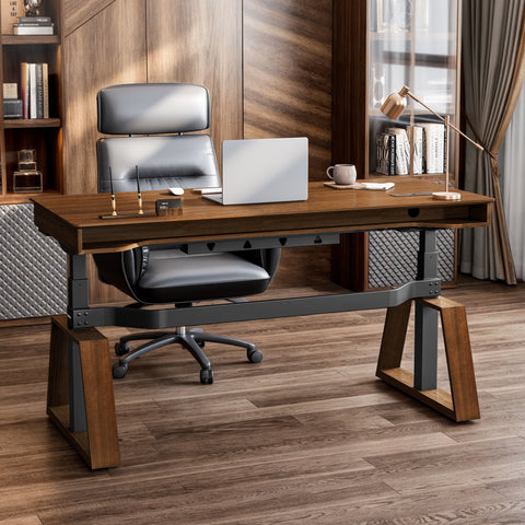
- Midground Layer: This is your opportunity to add functional furniture and personality. A low-profile cabinet, like the Ark EL, 29" Display File Storage Cabinet, Oak, can serve as a stylish anchor. It provides a surface for placing objects and breaks up the vertical plane of the wall.
- Foreground Layer: Objects placed on your midground furniture. This could be a plant, a stack of books, or a favorite figurine. A tall plant placed in the corner of the room can also serve this purpose, creating a visual element that feels closer to the camera than the wall itself.

Debunking the Myth: “A Busy Background Looks More Creative”
A common misconception, especially among gamers and creators, is that a background packed with memorabilia, posters, and gear looks authentic and visually interesting. In reality, it often translates to on-camera chaos. The most effective backdrops master the use of negative space—the empty areas around your decor. A good rule of thumb is to leave at least 15-25% of the background visually "empty." This breathing room gives your focal items impact and prevents the viewer’s eye from getting overwhelmed. Your background should support you, not compete with you.
Mastering Composition and Balance
With depth established, the next step is arranging your decor. Random placement leads to a feeling of unease. Purposeful composition, based on timeless artistic principles, creates harmony and directs the viewer’s attention.
The Rule of Thirds for Your Wall
You may know the rule of thirds for framing a camera shot, but it’s just as powerful for arranging your decor. Imagine a 3x3 grid overlaid on the wall behind you. The most visually appealing points to place dominant objects are at the intersections of these lines, not dead center. Avoid perfect symmetry. An asymmetrical arrangement feels more natural and dynamic.
A practical heuristic I use is the "one dominant, two supporting" formula. Choose one large, dominant object—perhaps a single large art piece or a prominent shelf—and place it off-center. Then, add one or two smaller supporting pieces in the opposing quadrant to create balance.
Achieving Visual Weight and Scale
Scale is crucial for preventing your background from looking like a dollhouse or, conversely, being dwarfed by one massive object. A simple guideline is to have your single dominant object be roughly one-third of the total frame height in your typical camera shot. This ensures it has presence without completely taking over the scene.
Staggering the heights of objects on shelves is another expert trick. Arranging items of varying heights—for example, by 8 to 12 inches—creates a more organic and interesting skyline than a flat, uniform row of collectibles.
Checklist for a Balanced Backdrop
Use this structured checklist to guide your arrangement process. It provides a methodical way to apply these principles and test your setup.
| Step | Action | Key Consideration | Goal |
|---|---|---|---|
| 1. Frame Your Shot | Set up your camera in its final position and resolution. | This is your canvas. Don't decorate areas that will be out of frame. | Define the boundaries of your background. |
| 2. Place Dominant Object | Position your single largest decor item (e.g., large poster, main shelf) on a rule-of-thirds intersection. | Should be approx. 1/3 of the frame's height. | Create a strong, off-center focal point. |
| 3. Add Supporting Items | Place 1-2 smaller objects or groups of objects in an opposing quadrant. | These items should balance the visual weight of the dominant object. | Achieve asymmetrical balance. |
| 4. Layer for Depth | Add a mid-ground element (plant, lamp, cabinet) between you and the wall. | Ensure it doesn't obstruct key decor. | Create a sense of three-dimensional space. |
| 5. Check Negative Space | Step back and look at the whole picture. Are there areas for the eye to rest? | Aim for 15-25% of the background to be clear of decor. | Prevent visual clutter and improve focus. |
| 6. Record and Review | Film a short test clip, talking and moving as you normally would. | Watch the clip on a full screen. Does anything feel distracting or unbalanced? | Finalize the composition based on real-world results. |
Lighting Your Backdrop Like a Pro
Lighting is what brings your carefully composed background to life. It sets the mood, directs focus, and ensures you look your best. Bad lighting can ruin even the most perfectly arranged decor.
The Brightness Ratio: Keeping the Focus on You
A mistake I often see is a background that’s lit as brightly as the person in front of it. This flattens the image and makes you blend in. The goal is separation. A professional technique is to light your background to be approximately 30-60% as bright as the key light on your face. This ensures you remain the brightest, most important part of the frame, while the background creates a rich, atmospheric context.
Using Color and Temperature with Intention
Colored lighting is a fantastic tool for expressing brand identity and mood, but it must be used correctly. Keep any light that faces you or illuminates your skin in the neutral white range (typically 2700K to 4500K). This prevents unnatural color casts.
Save the vibrant colors for the wall behind you. This is where products like the Lucet Art Lighting, 9.5x8 Per Piece excel. You can use them to wash a wall in a specific hue or create dynamic, music-synced effects, adding a layer of personality without compromising your skin tone. It’s the perfect way to build ambiance.

Controlling Reflections and Glare
Glossy surfaces are the enemy of good video lighting. Reflections from monitors or key lights on glass picture frames, polished furniture, or even glossy posters can create specular highlights—bright, distracting hotspots that pull the viewer’s eye. When choosing decor, opt for matte or non-reflective finishes where possible. If you have glass cabinets, consider placing low-intensity LED strips inside them to make them a light source rather than a reflective surface. As noted in guidance from occupational health bodies like the UK's Health and Safety Executive (HSE), controlling screen glare is essential for comfort and focus, and this principle extends to the entire visual environment.
Function Meets Form: Practical and Safe Integration
A great background isn’t just a static set piece; it’s part of a functional workspace. The final layer of mastery is integrating your practical needs—gear, storage, and safety—into your aesthetic design.
The Organized Creator: Pegboards and Shelving
Your most-used gear should be accessible, not buried in a drawer. A wall-mounted pegboard is a perfect solution for this. It turns your tools—controllers, headphones, cables—into a clean, organized part of the decor. The Aegispeg Board is designed for this, mounting directly to your desk to keep your essential computer accessories within arm’s reach without cluttering your desktop.
When routing cables, think like a set designer. Route them behind shelves or along the edges of furniture. The goal is to hide power strips off-frame and keep your setup looking clean and intentional.
Mounting with Confidence: Safety First
When adding heavy items like shelves or cabinets to your background, safety is non-negotiable. Always anchor them securely. A common and dangerous mistake is using a simple drywall screw for a heavy object. You must locate the studs—the wooden supports inside your wall—and anchor heavy items directly to them. For furniture like storage units, using an anti-tip-over kit is critical. This is so important that there are mandatory safety standards for it, such as the CPSC STURDY Act, which requires anchoring for clothing storage units. While your decor may not be a dresser, the physics are the same: a top-heavy, unsecured object is a hazard. Always use anchors rated for the load you intend to mount.
The Final Polish: Iterative Testing
Your first attempt at arranging your background won’t be your last. The key to a truly polished look is iteration. Use the "record and review" step from the checklist. Watch your test footage and ask critical questions: Where does my eye go first? Is that intentional? Is there anything distracting me from the speaker? Adjust the placement of an object by just 5-10% and record again. This refinement process is what takes a good background and makes it truly great.
Key Takeaways
Crafting a professional, balanced backdrop is an exercise in thoughtful curation, not accumulation. It’s about applying fundamental design principles to create a space that is both functional and visually harmonious. By focusing on depth, balance, and lighting, you can elevate your on-camera presence and build a stronger connection with your audience.
Remember these core ideas:
- Create Depth: Use physical separation and layering to build a three-dimensional scene.
- Compose with Balance: Apply the rule of thirds and manage visual weight to guide the viewer’s eye.
- Light with Intention: Use light ratios and color to set the mood and keep the focus on you.
- Integrate Safely: Combine function with form by organizing gear smartly and anchoring all heavy objects securely.
Your background is more than just a wall—it’s the stage for your story. Arrange it with purpose.
Disclaimer: This article is for informational purposes only. When mounting heavy objects, such as shelves or cabinets, always follow the manufacturer's instructions and use appropriate hardware for your wall type. If you are unsure, consult a qualified professional. Adhering to safety standards, like those recommended by the U.S. Consumer Product Safety Commission (CPSC), is crucial for preventing accidents.
Leave a comment