
The Psychology of Executive Color Palettes
Imagine a workspace that doesn’t just function but communicates authority. The colors you choose for your executive office are a silent partner in your professional narrative. They have a profound impact on mood, perception, and even productivity. Gone are the days of monolithic mahogany and stuffy, dark-paneled rooms. The modern executive aesthetic is built on sophisticated, nuanced color palettes that create an environment of focus, clarity, and modern elegance.
Beyond Beige: The New Power Neutrals
The foundation of a commanding executive space often begins not with a bold, loud color, but with a refined neutral. However, modern neutrals have evolved far beyond basic beige or sterile white. Think in terms of deep charcoal, slate gray, and complex warm grays. These colors provide a versatile and sophisticated backdrop that allows key furniture pieces and accent colors to stand out. A strong neutral base feels intentional and calm, reducing visual clutter and allowing for greater mental clarity.
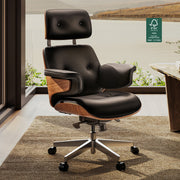
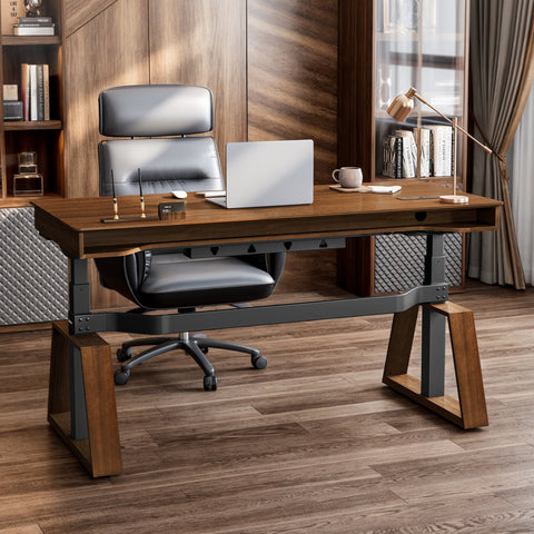
For instance, anchoring a room with a substantial piece like the Zen Pro Series Executive Standing Desk establishes an immediate sense of gravitas. Its Lauren Black Gold Sintered Stone desktop isn’t just a surface; it’s a statement. The material’s subtle, organic texture set against a deep, matte black creates a focal point that is both powerful and grounding. This is the new neutral—a color with depth, character, and an unwavering professional presence.

The 60-30-10 Rule: A Framework for Balance
A common mistake in office design is an unbalanced color scheme that feels either chaotic or monotonous. A proven design principle to avoid this is the 60-30-10 rule. It’s a simple yet powerful framework for creating a harmonious and visually appealing space.
- 60% Primary Color: This is your dominant, foundational hue. It typically covers the largest surface areas, such as your walls and perhaps the main surface of your desk.
- 30% Secondary Color: This color supports the primary hue and adds visual interest. It’s often used for secondary furniture like storage cabinets, an accent wall, or an area rug.
- 10% Accent Color: This is your pop of color, used sparingly to draw attention to key details. Think metallic trim, lighting fixtures, artwork, or small decor items.
Adhering to this rule ensures your palette remains intentional and uncluttered. Here is how it can be applied to create distinct executive aesthetics:
| Palette Style | 60% Primary (Dominant) | 30% Secondary (Material) | 10% Accent (Highlight) |
|---|---|---|---|
| Monochromatic | Light Gray Walls | Charcoal Desk & Dark Gray Chair | Black Metal Legs & Trim |
| High-Contrast | Off-White Walls | Black Sintered Stone Desk | Polished Chrome or Brass |
| Earthy | Warm Greige Walls | Walnut Desk & Brown Leather Chair | Deep Green Plant & Bronze |
This structured approach removes the guesswork, allowing you to build a layered, professional environment that feels cohesive and thoughtfully curated.
Crafting Your Signature Palette: Three Modern Approaches
Your office palette should be a reflection of your personal brand. Are you grounded and traditional, bold and decisive, or calm and focused? Here are three modern color strategies that can be adapted to suit your executive style.
The Monochromatic Power Base
A monochromatic scheme, which uses varying tones of a single color, is the epitome of modern sophistication. It creates a serene and uncluttered ambiance that is highly conducive to deep work. The key to a successful monochromatic room is not just the color but the rich interplay of textures. Without texture, a single-color room can feel flat and uninspired.
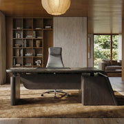
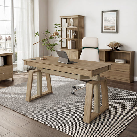
Imagine a palette built around warm, earthy browns. You could start with a rich, foundational piece like the Ark Executive Standing Desk, with its natural walnut veneer providing a warm and inviting primary surface. The subtle grain of the wood already introduces a layer of organic texture. From there, you can layer in a slightly darker brown leather chair, a lighter taupe rug, and sheer linen curtains. The result is a space that feels cohesive, calming, and incredibly refined. The different materials—wood, leather, fabric—all reflect light differently, adding depth and preventing the space from feeling one-dimensional.

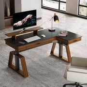
High-Contrast Authority
For a bolder, more decisive statement, a high-contrast palette is unparalleled. The classic combination of black and white, or dark wood against a light backdrop, creates a dynamic and energetic environment. This approach communicates clarity, strength, and a forward-thinking mindset.
However, a common pitfall is creating a space that feels too stark or cold. The solution lies in balancing the core contrast with softer materials and strategic accents. The Ark X Executive Standing Desk exemplifies this balance perfectly. It flawlessly combines an oak paper surface with an exquisite black leather work area, immediately establishing a powerful visual contrast. This is then softened by the warm wood tones of the desk’s body and its unique K-shaped wooden legs. When pairing a dark desk with light walls, it is wise to avoid high-gloss desktop finishes, as they can create distracting reflections on your monitor, a lesson learned from many office fit-outs.

Earthy and Grounded Sophistication
To cultivate a workspace that promotes calm and sustained focus, consider an earthy palette. Drawing inspiration from the natural world, these schemes often feature deep olive greens, rich terracotta, and soothing shades of brown and gray. These colors are inherently grounding and can help reduce stress, making them ideal for a high-stakes executive role.
This aesthetic pairs beautifully with natural materials. Think of a deep forest green accent wall behind a walnut or oak desk. Complement it with plants, natural fiber rugs, and leather or woven fabric upholstery. These palettes feel less corporate and more personal, creating a sanctuary for thought and strategy. They connect us to the outdoors, which can have a restorative effect during a long workday.
Material and Texture: The Unspoken Language of Color
Color doesn’t exist in a vacuum. The material it’s applied to—and the light that illuminates it—dramatically affects its perceived character. In an executive office, the tactile quality of your surfaces is just as important as the visual hue.
Wood, Stone, and Metal
The choice of materials is fundamental to your color palette. A natural walnut veneer, like that on the Ark desk, brings an inherent warmth and organic pattern that a flat, painted surface cannot replicate. It feels solid, reliable, and timeless. In contrast, a sintered stone top, as seen on the Zen Pro, offers a cool, matte finish that speaks to modern technology and industrial precision. It’s exceptionally durable and resistant to scratches, conveying a sense of permanence.
Metal accents provide the crucial "10%" in your 60-30-10 rule. The choice between matte black, brushed brass, or polished chrome can completely shift the mood of the room. Black metal often feels modern and industrial, while brass or bronze can introduce a touch of classic luxury.
The Importance of Light and Sheen
A critical mistake many make is selecting colors from small swatches under store lighting. A color can look entirely different in your office, bathed in the warm light of a morning sun or the cool glow of an evening lamp. Always test your color and material samples in the actual space at different times of day. Place them next to your flooring and wall finishes to see how they interact.
This leads to a common misconception we must debunk. The Myth: A dark-colored office is inherently more professional and serious. The Reality: While dark tones like charcoal and black can convey authority, they can also create a gloomy, oppressive, and fatiguing environment without a strategic lighting plan. According to guidance from the U.S. Occupational Safety and Health Administration (OSHA) on workstation environments, improper lighting is a major cause of eye strain. An all-dark office with poor lighting can lead to visual fatigue and reduced productivity. The most effective executive spaces balance rich, dark tones with layered lighting—combining ambient (overall), task (focused on the work area), and accent lighting to create depth, visual interest, and a comfortable working ambiance.
Ergonomics and Aesthetics in Harmony
A beautifully designed office is ultimately a failure if it’s uncomfortable to work in. True executive presence comes from a seamless fusion of sophisticated aesthetics and uncompromising ergonomic function. The goal is to create a workspace sanctuary that supports your well-being and enhances your workflow.
A cluttered, poorly designed space can increase cognitive load and contribute to stress. Conversely, a clean, organized, and aesthetically pleasing office can promote a state of flow and deep work. This is why features like integrated drawers and hidden cable management, found in well-designed executive desks, are not just about tidiness—they are about creating a visually calm environment that allows your mind to focus on the tasks that matter.
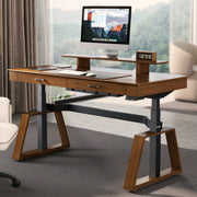
Furthermore, the ability to change your posture is critical. The World Health Organization recommends reducing sedentary time and interrupting long periods of static behavior. An adjustable-height desk allows you to effortlessly transition between sitting and standing, which can help reduce the fatigue associated with static postures. For a deeper dive into optimizing your workspace, consider this guide on [Setting Up Your Standing Desk for Peak Productivity](https://eurekaergonomic.com/blogs/eureka-ergonomic-blog/standing-desk-setup-productivity-guide). Some experts, like those at Cornell University's Ergonomics Web, even suggest a "20-8-2" rhythm: 20 minutes of sitting, 8 minutes of standing, and 2 minutes of moving or stretching. This approach, facilitated by an ergonomic desk, turns your office from a static environment into a dynamic one.
Key Takeaways for a Commanding Workspace
Crafting the perfect executive office is a strategic endeavor. Your color and material choices are not merely decorative; they are tools for building an environment that reflects your authority, supports your focus, and promotes your well-being. By moving beyond outdated design tropes and embracing a modern, holistic approach, you can create a workspace that is as ambitious and forward-thinking as you are.
Remember these core principles:
- Embrace the New Neutrals: Build your foundation on sophisticated grays, charcoals, and warm, earthy tones.
- Use the 60-30-10 Rule: Create a balanced and harmonious palette by assigning your colors to dominant, secondary, and accent roles.
- Layer Texture and Light: A monochromatic room comes alive with varied textures. Always test colors in your actual space under different lighting conditions.
- Fuse Aesthetics with Ergonomics: A truly powerful office is one that is not only beautiful but also supports your physical health and enhances your productivity.
Frequently Asked Questions (FAQ)
What is the best color for productivity in an executive office?
There is no single "best" color, as the effect is highly personal. However, certain colors are commonly associated with specific psychological responses. Blue tones are often linked to focus and calm, while green can be grounding and balancing. Powerful neutrals like charcoal gray and deep brown create a stable, focused environment free from distraction.
Can a black desk work in a smaller home office?
Absolutely. A black desk can serve as a powerful anchor in a smaller room. The key is to create balance. Pair it with lighter walls (like off-white or a very light gray) to prevent the space from feeling cramped. Use reflective accents, such as a brass lamp or chrome hardware, and ensure the room has ample ambient and task lighting to keep it feeling open and bright.
How do I choose an office chair color to match my desk?
Follow the advice of professional designers. You have two primary options for a sophisticated look: go for a complementary contrast (e.g., a light cream or gray leather chair with a dark walnut desk) or a tonal match within the same color family (e.g., a dark brown leather chair with a walnut desk). Avoid mixing warm and cool tones in your main pieces, as it can look disjointed.
Disclaimer: This article is for informational purposes only and does not constitute professional design or medical advice. The ergonomic suggestions provided are based on general principles, and you should consult with a qualified professional, such as an ergonomist or physical therapist, for guidance tailored to your specific needs, especially if you have pre-existing health conditions.
References
- Cornell University Ergonomics Web — Workstation Guides: https://ergo.human.cornell.edu/ergoguide.html
- OSHA eTools: Computer Workstations - Workstation Environment: https://www.osha.gov/etools/computer-workstations/workstation-environment
- WHO 2020 Guidelines on Physical Activity & Sedentary Behaviour: https://www.who.int/publications/i/item/9789240015128
Leave a comment