
Your Desk, Your Sanctuary: Choosing a Color That Inspires
Imagine a workspace that doesn’t just function, but actively fuels your creativity and focus. The centerpiece of this sanctuary is your desk. Its color, texture, and finish are the first things you see and touch each day. They set the tone for your entire workflow. Yet, choosing a color can feel like a daunting, permanent decision. It’s far more than picking a favorite shade from a catalog; it’s an act of design that can either create harmony or introduce subtle, persistent distraction.
Going beyond basic black and white opens up a world of possibilities. This guide is your map. We will explore the principles of color theory, the practical science of materials, and the real-world wisdom of designers to help you select a standing desk that not only fits your space but also reflects your unique personality and work style. Let's transform your desk from a piece of furniture into the very foundation of your best work.
The Psychology of Color in Your Workspace
Color is a silent communicator. It influences our mood, concentration, and even our energy levels. Understanding this language is the first step in choosing a desk that works for you on a psychological level, creating an environment where you feel both comfortable and productive.
How Colors Shape Your Mood and Focus
The color of your primary work surface can subtly nudge your state of mind throughout the day. Different color families evoke distinct emotional and mental responses.
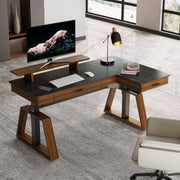
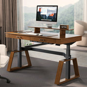
- Warm Tones (Woods, Beiges, Rustic Browns): These colors are grounding and comforting. A warm wood finish connects us to the natural world, creating a sense of calm and stability. They are perfect for crafting a cozy, welcoming workspace that feels less like a sterile office and more like a personal retreat. A desk with a rustic finish, like the L-Shaped Standing Desk with Accessories Set (60"x23"), can make a space feel instantly more inviting and relaxed, ideal for long sessions of thoughtful work.
- Cool Tones (Grays, Whites, Light Woods): Associated with clarity and serenity, cool tones create a clean, uncluttered aesthetic. A white or light gray desk can make a room feel more spacious and open, promoting a sense of order and focus. These colors are a cornerstone of minimalist design, helping to reduce visual noise and allowing your mind to concentrate on the task at hand.
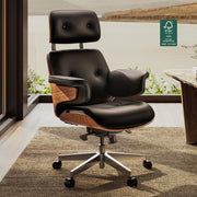
- Bold & Dark Tones (Black, Charcoal, Deep Blues): Dark finishes convey sophistication, power, and stability. A black desk can act as a strong anchor in a room, creating a striking contrast that helps other design elements stand out. These colors are excellent for creating a space with a serious, professional ambiance. The elegant Lauren Black Gold Sintered Stone on the Zen Pro Series, 87"/72" Executive Standing Desk with Cabinets Set, for instance, establishes a commanding presence that is both luxurious and focused.

Aligning Your Desk with Your Work Style
The ideal color for your desk also depends on the type of work you do. Think of your desk color as a tool to support your specific professional needs.
- For Deep Work and Intense Focus: If your days are filled with coding, writing, or detailed analysis, neutral and cool tones are your allies. They minimize visual distractions, creating a serene backdrop that helps you stay in a state of flow.
- For Creative and Dynamic Tasks: Designers, marketers, and artists often thrive in environments that spark inspiration. Warmer wood tones, or even desktops with subtle patterns, can provide a touch of organic energy without being distracting.
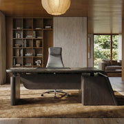
- For Executive Presence and Leadership: In roles that require a sense of authority and decision-making, darker woods, rich leather inlays, and stone finishes project confidence. A desk like the Ark X Executive Standing Desk (60"x26"), which combines oak and black leather, offers a timeless, dignified aesthetic perfect for a leader's office.
Beyond Hue: The Critical Role of Material, Texture, and Finish
The color you see is only part of the story. The way a surface feels, how it interacts with light, and how it stands up to daily use are just as important. The material and finish of your desk have a massive impact on both its aesthetic appeal and its long-term practicality.
The Practicality of Finishes: Matte vs. Gloss
One of the most common mistakes I see is choosing a finish based solely on its showroom appeal. How a desk looks under perfect lighting is very different from how it performs in a real home office.
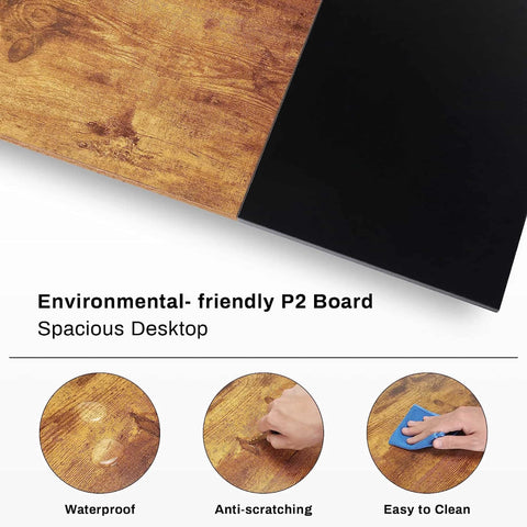
- Matte or Low-Sheen: This is the workhorse of desktop finishes. A matte surface diffuses light rather than reflecting it. According to the OSHA eTools guide on Workstation Environment, minimizing glare is crucial for reducing eye strain. Matte finishes excel at this, creating a comfortable viewing experience even in brightly lit rooms. They also do a much better job of concealing fingerprints and micro-scratches, making them a low-maintenance choice for a high-traffic workspace.
- High-Gloss: A glossy finish can be visually stunning, adding a sleek, modern touch and reflecting light to make a small space feel brighter. However, this comes with trade-offs. The high reflectivity can create significant screen glare, a known contributor to workplace discomfort. These surfaces also require more maintenance, as they prominently display every fingerprint, smudge, and speck of dust.
The Durability of Texture and Pattern
A perfectly uniform, solid-colored desktop looks pristine at first, but it's the least forgiving when it comes to daily wear.
Real-world experience shows that textured or patterned surfaces are superior for longevity. Wood grains, stone patterns, and textured laminates are excellent at camouflaging the minor scuffs, scratches, and oils that accumulate with daily use. A sintered stone top, for example, offers incredible resistance to scratches and heat while providing a unique, natural pattern. Similarly, a rustic wood veneer not only adds warmth but also effectively hides imperfections, ensuring your desk looks great for years to come.
Debunking a Common Myth: "Dark Desks Always Shrink a Room"
There's a persistent belief that a large, dark piece of furniture will inevitably make a small room feel cramped. This is a misunderstanding of how visual weight works in interior design.
In reality, a dark desk can act as a powerful anchor, creating a focal point that adds depth and definition to a space. The key is balance. A black or dark walnut desk placed in a room with light-colored walls, ample natural or artificial light, and uncluttered surroundings doesn't shrink the space—it grounds it. By drawing the eye, it can make the rest of the room feel more organized and intentional, lending an air of sophisticated stability that a lighter desk might lack.
A Strategist's Guide to Harmonizing Your Workspace
Your desk doesn't exist in a vacuum. To create a truly cohesive workspace sanctuary, you must consider how its color and style interact with the rest of your environment. This is where a few simple design rules can make all the difference.
The Rule of Tones: Coordinating with Your Environment
A simple but effective guideline used by interior designers is to keep your desktop one to two tones lighter or darker than the largest surface in the background, which is typically the wall or the floor. This creates a pleasing contrast that prevents the desk from either disappearing into or clashing with its surroundings.
- Example 1: If you have medium-gray walls, a light oak or a deep charcoal desk will both look fantastic.
- Example 2: Against a light beige or off-white wall, a rich walnut desk creates a warm, inviting focal point.
This principle of contrast is supported by ergonomic best practices. As noted by authorities like the Canadian Centre for Occupational Health and Safety (CCOHS), managing the visual environment is key to comfort. A desk that harmonizes with its surroundings reduces visual stress and contributes to a more calming atmosphere.
The Frame Game: Don't Forget the Legs
The desktop gets all the attention, but the frame is a critical design element. A common oversight is choosing a frame color that clashes with the other hardware in the room. For a seamless look, try to coordinate the desk frame with your monitor arm, lamp, drawer pulls, and even window frames. When in doubt, a neutral black, charcoal, or silver frame is the most forgiving and versatile option, working well with nearly any color scheme.

The "Full Picture" Test: Accessories Matter
Never choose a desk color in isolation. A bold, vibrant desktop might look amazing on its own, but its perceived intensity can change dramatically once you add your keyboard, mousepad, monitors, and speakers. These accessories cover a significant portion of the surface and introduce their own colors and textures.
A pro tip is to test the full setup before committing. Get a large swatch or sample of the desktop material you're considering. Place it where your desk will go and arrange your primary accessories on top of it. View it at different times of day to see how it looks in both natural and artificial light. This simple step can save you from a costly design mistake and ensure the final result is exactly what you envisioned. For more ideas on integrating your desk, see our guide on How to Match a Standing Desk to Your Home Office Style.
Your Decision-Making Checklist
Choosing the right color is a process of balancing aesthetics, practicality, and personal preference. Use this framework to guide your decision and select a desk that you'll love for years.
| Priority Factor | Question to Ask Yourself | Color Family Recommendation | Material/Finish Tip |
|---|---|---|---|
| Primary Use | Is this for intense focus, creative brainstorming, or executive tasks? | Focus: Neutrals/Cools. Creative: Warms/Subtle Patterns. Executive: Darks/Rich Textures. | Matte finishes are ideal for screen-heavy work as they minimize glare. |
| Room Size & Light | Is the room small and dark, or large and bright? | Small/Dark Room: Lighter woods, white. Large/Bright Room: Any color, including bold darks. | A glossy finish can help reflect light, but be mindful of reflections on your screen. |
| Existing Decor | What are the colors of my walls, floor, and major furniture? | Follow the one-to-two tones rule. Match undertones (e.g., warm wood with warm gray walls). | Match the desk frame to existing metal hardware in the room for a cohesive look. |
| Maintenance Level | How much time am I willing to spend cleaning? | Low Maintenance: Textured wood, matte finishes, patterned stone. High Maintenance: High-gloss, solid dark colors. | Textured laminates and sintered stone are exceptionally durable and hide minor wear. |
| Personal Style | Do I prefer minimalist, industrial, classic, or cozy aesthetics? | Minimalist: White/Light Oak. Industrial: Rustic/Dark Wood + Black Frame. Classic: Walnut/Leather. | Consider a desk with a unique leg design for an extra touch of personal style. |
Wrapping Up: Crafting Your Workspace Sanctuary
Your standing desk is the most important tool in your workspace. Choosing the right color is not a frivolous detail; it is an essential step in creating an environment that supports your well-being and enhances your productivity. By considering the psychology of color, the practicalities of materials, and the way your desk harmonizes with its surroundings, you move beyond simply buying furniture. You begin the intentional design of your personal workspace sanctuary.
The perfect desk is a reflection of your personal brand and a catalyst for your best work. It invites you to begin your day with a sense of purpose and clarity. By making a thoughtful, informed choice, you invest in a space that will inspire you for years to come.
Disclaimer: This article is for informational purposes only and does not constitute professional interior design or medical advice. The ergonomic setup of your workstation is critical for your health. Please consult with a qualified ergonomist or healthcare provider for personalized recommendations, especially if you have pre-existing health conditions.
References:

Leave a comment