
The Art of Simplicity: Crafting a Modern Minimalist Workspace
Imagine a workspace that feels like a breath of fresh air. A desk where every object has a purpose, the colors are calm and cohesive, and your mind is free to focus on what truly matters. This isn't about stark, empty rooms; it's about creating a Workspace Sanctuary—an environment designed for clarity, creativity, and deep work. The secret to achieving this modern minimalist aesthetic lies not in what you remove, but in the deliberate choices you make, starting with the most fundamental element: your color palette.
The right colors do more than just please the eye; they set the tone for your entire workflow. They can energize, soothe, or sharpen your focus. In this guide, we'll move beyond generic advice and explore how to build a sophisticated, minimalist desk setup from the ground up. We’ll cover curated color palettes and provide practical steps to transform your desk, chair, and accessories into a single, harmonious composition that inspires your best work.
The Foundation: Core Principles of Minimalist Color
Before we dive into specific palettes, let's establish the principles that guide a minimalist aesthetic. This philosophy is about intentionality, not deprivation. It’s about creating visual peace so your mind can thrive.
The 60-30-10 Rule: A Framework for Balance
A timeless design principle, the 60-30-10 rule is the perfect starting point for building your palette. It ensures a balanced and visually appealing space.
- 60% Primary Hue: This is your dominant color, the foundation of your setup. It will typically cover the largest surfaces, like your desk and perhaps a nearby wall. This color sets the overall ambiance.
- 30% Secondary Hue: This color supports the primary hue and adds visual interest. It's often used for items like your chair, storage cabinets, or a large desk mat.
- 10% Accent Hue: This is where you can inject a bit of personality. The accent color is used sparingly on small items like a mug, a notebook, or subtle decor. It provides a pop of contrast without overwhelming the space.
Texture as a Color
In a minimalist setup, texture plays a crucial role. When your color palette is restrained, materials like natural wood, matte metal, smooth leather, or woven fabric add depth and warmth. A smooth walnut desktop, for example, offers a rich visual experience that a flat brown color cannot. This tactile variety prevents a simple color scheme from feeling flat or boring.
Curated Palettes for Your Workspace Sanctuary
With our principles in place, let's explore three versatile color palettes that embody the modern minimalist spirit. Each one creates a distinct mood, allowing you to tailor your workspace to your personal workflow and aesthetic preferences.
Palette 1: Sophisticated Monochrome
The monochrome palette is a timeless classic. Built on shades of black, white, and gray, it creates a clean, focused, and undeniably sophisticated environment. The beauty of this palette lies in its simplicity, which allows the form and function of your furniture to take center stage.
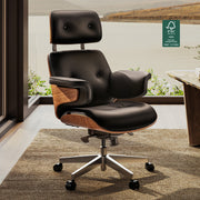
A common approach is to use a white or light gray desk as the 60% base, a black ergonomic chair as the 30% secondary color, and metallic or dark gray accessories for the 10% accent. This creates a high-contrast look that is both striking and professional. To prevent the space from feeling cold, introduce textures like a black leather desk mat or the sleek finish of a Carbon Fiber Dual Monitor Stand. This accessory not only elevates your screens to an ergonomic height but also adds a modern, high-tech texture to your setup.

Palette 2: Warm Neutrals & Natural Woods
If you crave a workspace that feels calming, grounded, and inviting, a warm neutral palette is the perfect choice. This scheme uses soft, earthy tones like beige, cream, taupe, and, most importantly, the rich character of natural wood.
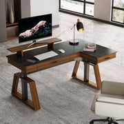
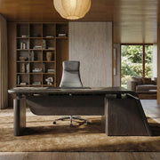
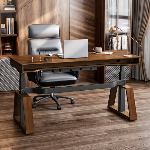
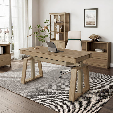
For this palette, a beautiful wood desk serves as the centerpiece. The Ark Executive Standing Desk, with its stunning walnut finish, is an ideal foundation. Its natural grain and warm tones provide the 60% primary hue, creating an immediate sense of warmth and stability. Pair it with a chair in a soft gray or cream fabric (30%), and finish with accents in brass, black, or even a deep forest green (10%). This combination feels organic and serene, helping to reduce stress and encourage a mindful workflow.
Expert Warning: Not All Woods Are Equal
A common belief is that any wood will warm up a space. However, for those doing color-sensitive work like graphic design or video editing, this can be a pitfall. As expert designers know, woods with strong orange or red undertones can cast a warm hue on white screens or paper, subtly altering your color perception. If color accuracy is critical, opt for cooler, desaturated woods or high-quality laminates that offer a more neutral tone.
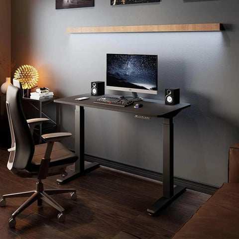
Palette 3: Cool Tones & Industrial Edge
For a sleek, modern, and task-oriented ambiance, a cool-toned palette is an excellent option. This palette draws from shades of cool gray, muted blues, and the raw textures of industrial materials like concrete and steel. It’s a favorite for developers, architects, and anyone who thrives in a structured, uncluttered environment.
Your 60% base could be a light gray or even a white desk. The key is to ensure the undertones are cool. For your 30%, consider a chair in a charcoal or navy blue fabric. The 10% accent is where you can introduce a touch of brushed metal, such as a silver monitor arm or desk lamp. This palette is clean and efficient, minimizing visual distractions to help you achieve a state of deep focus.
Applying the Palette: From Desk to Details
Once you've chosen your palette, it's time to apply it. The goal is to create a cohesive system where every element works together.
The Desk as Your Canvas
Your desk is the largest and most important piece of furniture, so its color and finish are critical.
- Matte vs. Gloss: While high-gloss surfaces can look striking, they often create glare, especially under direct lighting. A common misconception is that an all-white desk is the pinnacle of minimalism. In reality, a matte white or light greige finish is often softer on the eyes and just as clean-looking. According to industry experts, mid-tone surfaces are also better at hiding dust and minor smudges, keeping your workspace looking tidier.
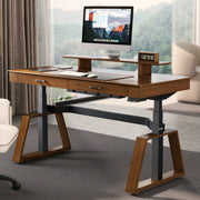
- Integrated Solutions: To maintain a clean look, choose a desk with integrated cable management. A desk like the L-Shaped Standing Desk with Accessories Set not only provides ample space but also includes features like a socket holder to keep wires hidden, preserving the minimalist aesthetic.

Accessorizing with Intent
Accessories are the final layer of your design. This is where the 10% accent color comes into play, but it's also about adding functionality that enhances your workflow. An ergonomic Pull-out Keyboard Tray can keep your main surface clear while promoting better posture. A monitor stand organizes your screens and provides storage space underneath. Choose accessories that align with your chosen palette—for example, a black keyboard tray for a monochrome setup or a walnut one to complement a warm neutral desk.
Pro Tip: Master Your Lighting
Color doesn't exist without light. A common mistake is to mix different types of light, which can ruin a carefully chosen palette. Natural daylight is cool, while standard indoor bulbs are often warm. This mix can turn your perfect beige into a muddy yellow. To maintain color fidelity, use smart bulbs or dedicated task lighting that allows you to set a consistent color temperature. A range of 3500K–5000K typically provides clean, neutral light that keeps your colors true throughout the day. This aligns with guidance from sources like the OSHA eTools on Workstation Environment, which emphasize the importance of proper lighting for reducing eye strain.
Common Misconception: Contrast is Just for Looks
A frequent myth in minimalist design is that low contrast—like a black mouse on a black desk—is the ultimate in sleekness. In reality, this can be a usability nightmare. For a workspace to be functional, you need to be able to distinguish your tools easily. This principle is so important that it's a core part of web accessibility. The W3C's Web Content Accessibility Guidelines (WCAG) recommend specific contrast ratios to ensure text is readable. We can apply this same thinking to our physical workspace. Your keyboard, mouse, and notebook should have a clear visual contrast against your desk surface to reduce cognitive load and help you work more efficiently.
Here is a simple checklist to ensure your setup is both beautiful and functional:
| Minimalist Contrast Checklist | Yes/No | Notes |
|---|---|---|
| Keyboard vs. Desk Surface | Can you easily see the edges of your keyboard? | |
| Mouse vs. Desk Mat/Surface | Is your mouse clearly visible against its background? | |
| Notebook vs. Desk Surface | Does your primary notebook stand out? | |
| Key Peripherals vs. Background | Are your most-used items easy to locate at a glance? |
Wrapping Up: Your Sanctuary Awaits
Creating a modern minimalist desk setup is a journey of intentionality. It begins with a vision of a workspace that supports you, followed by the deliberate selection of a color palette that brings that vision to life. By applying principles like the 60-30-10 rule and paying close attention to texture, light, and functional contrast, you can transform your desk from a place of clutter into a true Workspace Sanctuary.
Start with your foundational piece—the desk—and build from there. Whether you choose the sophisticated calm of monochrome, the inviting warmth of natural woods, or the focused energy of cool tones, let your palette guide you toward a space that is not only beautiful but also a powerful tool for productivity and peace of mind.
Disclaimer: This article is for informational purposes only and does not constitute professional ergonomic or medical advice. Please consult a qualified professional for guidance on your specific needs, especially if you have pre-existing health conditions.
Leave a comment