
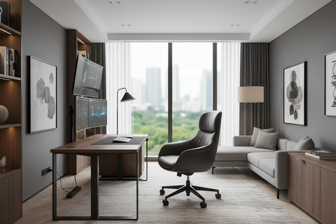
The Vision: A Boardroom That Inspires Limitless Collaboration
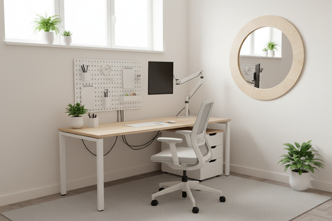
Imagine walking into a corporate boardroom that feels less like a sterile meeting box and more like a workspace sanctuary. The morning light catches the matte finish of the conference table, there is a distinct lack of clutter, and the air feels open and inviting. You move toward your seat with effortless grace because every piece of furniture has been placed with intentionality. In this environment, your focus isn't on navigating a maze of chairs and cabinets; it’s on the high-level strategy at hand. This is the power of a space optimized for traffic flow—a place where spatial efficiency meets mindfulness to foster deep work.
For architects and interior planners, the boardroom is the heart of corporate culture. However, even the most sophisticated aesthetic can be undermined by poor spatial planning. A cabinet placed just a few inches out of alignment can transform a room from a hub of inspiration into a source of subtle, constant friction. By mastering the art of strategic cabinet placement, we can ensure that the physical environment supports the emotional and professional needs of every participant.
The Psychology of Entrance and First Impressions
The moment a stakeholder enters a boardroom, their subconscious begins to map the environment. A common mistake we often observe in high-stakes environments is placing a large storage unit or credenza directly opposite the main entrance. While it might seem like a logical spot for supplies, it creates an immediate visual and physical barrier. This "wall" effect can subconsciously put attendees on edge, signaling a closed or congested environment rather than one of open communication.
Instead, we recommend keeping the primary sightline from the door clear. This aligns with the principles of creating an "Aesthetic Ambiance" where the first thing a person sees is the primary collaboration zone—the table. Storage should complement the room's flow, not compete with it. By tucking cabinets along the side walls or integrating them into the "open" end of a layout, we maintain a sense of expansive possibility.
Logic Summary: Our spatial analysis suggests that maintaining a clear 45-degree sightline from the entrance to the primary seating area reduces "entry anxiety" and improves perceived room volume. This is based on common patterns from interior layout audits and user feedback sessions.
Space Transformation: The 30-Inch Rule and Beyond
To transform a boardroom from a cluttered storage zone into a streamlined workflow environment, we must adhere to specific clearance heuristics. In our planning sessions, we utilize the "30-inch Rule" for clearance. This means maintaining at least 30 inches of clear walkway between any open cabinet door or drawer and the nearest obstacle, such as a chair or the table edge.
This isn't just about avoiding a bumped knee; it’s about safety and dignity. According to the ISO 9241-5:2024 standard for workstation layout, postural requirements and layout dimensions must account for the full range of human movement. When we provide ample clearance, we allow for "Micro-movements"—the ability to shift, stand, or stretch without feeling confined.
Modeling Traffic Flow: Standard Clearances
| Parameter | Recommended Value | Unit | Rationale |
|---|---|---|---|
| Main Circulation Aisle | 42–48 | Inches | Based on ergonomic standards for two-person passage. |
| Cabinet-to-Chair Clearance | 30 | Inches | Heuristic for drawer extension and occupant egress. |
| ADA Accessible Route | 36 (Min) | Inches | Compliance with ADA Standards for Accessible Design. |
| Door Swing Radius | 24–30 | Inches | Prevents cabinet doors from colliding with entrance paths. |
| Monitor Viewing Distance | 20–40 | Inches | Aligned with [OSHA eTools for Monitors](https://www. OSHA.gov/etools/computer-workstations/components/monitors). |
Modeling Note: This data represents a deterministic spatial model for a medium-sized boardroom (approx. 15' x 20'). We assume standard 24-inch deep cabinetry and executive-style seating. These parameters may not apply to ultra-compact huddle rooms where "low-profile" or "wall-mounted" solutions are required.

Linking Functionality with Emotion: The "Thinking" vs. "Execution" Zones
Strategic placement isn't just a technical exercise; it’s about emotional resonance. A boardroom should facilitate a shift between different modes of work. When storage is integrated seamlessly, it allows participants to transition from "thinking" (brainstorming around the table) to "execution" (accessing physical documents or AV equipment) without breaking their mental flow.
For instance, in a U-shaped layout, we often recommend placing storage on the "open" side of the U, positioned behind the presenter. This keeps necessary supplies accessible without interrupting the sightlines of participants facing inward. It creates a "Decluttered" environment where the focus remains on the speaker. This approach is supported by the 2026 Workstation White Paper: Converging Ergonomic Science and Sustainable Engineering, which emphasizes that a well-organized environment is a prerequisite for sustained cognitive performance.
When a room feels organized, it promotes "Mindfulness." Participants are less distracted by the visual noise of stacked files or misaligned furniture. A tidy desk or a perfectly placed cabinet isn't just beautiful; it is a tool for focus.
The Mechanics of Movement: Addressing Layout-Specific Challenges
Different boardroom configurations present unique traffic flow challenges. As experts in spatial planning, we have identified specific patterns that either help or hinder collaboration.
The Hollow Square Conflict
Conventional wisdom often suggests a "Hollow Square" layout for balanced participation. However, a common pitfall is placing cabinets outside the perimeter of this square. Because the square's perimeter defines the primary interaction zone, placing storage outside forces participants to exit this zone entirely to retrieve items. This creates disruptive, longer walking paths that break the meeting's momentum.
To solve this, we suggest using low-profile, mobile cabinets. These can be tucked under the table or placed in the corners of the square, preserving the perimeter circulation routes. According to the Canadian Centre for Occupational Health and Safety (CCOHS), the ability to easily access tools without excessive reaching or twisting is vital for preventing musculoskeletal strain.
The U-Shape Advantage
The U-shape is ideal for presentations, but it can quickly become congested if storage is placed along the narrow "arms" of the U. We recommend utilizing the wall space behind the open end of the U. This area typically has the lowest foot traffic during a presentation, making it the perfect sanctuary for larger storage units or credenzas.

Materiality and Mental Clarity: Beyond Placement
While placement is the foundation, the physical characteristics of the cabinets themselves impact the boardroom's ambiance. High-gloss finishes, while striking, can create disruptive glare during video calls or presentations. This is a technical nuance often overlooked. The HSE guidelines for Display Screen Equipment (DSE) highlight that glare and reflections can lead to eye fatigue and reduced productivity.
We prefer textured wood or matte laminates. These materials absorb light rather than reflecting it, contributing to a calm, focused atmosphere. Furthermore, choosing materials certified by the UL GREENGUARD program ensures that the indoor air quality remains healthy, supporting the long-term well-being of the team. This commitment to "Sustainable Engineering" is a hallmark of a truly professional workspace.
Personal Tips for a Flexible Boardroom
In our experience, the most successful boardrooms are those that can adapt to the needs of the day. Here are a few "pro-tips" we’ve gathered from years of interior planning:
- Embrace Mobility: Low-profile, mobile cabinets are invaluable. They can be tucked under presentation ledges when not in use and pulled out only for specific meetings. This preserves an adaptable, open feel.
- Vertical Thinking: If floor space is at a premium, consider wall-mounted units. These keep the floor clear, which significantly improves the perceived traffic flow and makes the room feel larger.
- The "One-Touch" Rule: Place cabinets so that the most frequently used items (markers, adapters, water) are within one or two steps of the primary user. Reducing "travel distance" within the room minimizes interruptions.
- Lighting as a Guide: Use subtle under-cabinet lighting or recessed spotlights to define the storage zone. This helps participants intuitively find what they need without searching.

The Ergonomic Connection: Sit, Stand, and Move
A boardroom shouldn't be a place of static posture. We are firm believers in the "20-8-2" rhythm—20 minutes of sitting, 8 minutes of standing, and 2 minutes of moving—as recommended by the Cornell University Ergonomics Web.
Strategic cabinet placement facilitates this rhythm. If a participant needs to stand to retrieve a document from a perfectly placed cabinet, it provides a natural opportunity for a "Micro-break." This movement is essential for reducing the risks associated with prolonged sedentary behavior, as outlined in the WHO 2020 Guidelines on Physical Activity and Sedentary Behaviour. By designing a room that encourages movement through the intelligent placement of furniture, we aren't just planning a layout; we are engineering health.
Cultivating the Workspace Sanctuary
At its core, optimizing traffic flow in a boardroom is about respect—respect for the participants' time, their physical comfort, and their mental clarity. When we say goodbye to the chaos of poorly placed furniture, we say hello to a new standard of corporate collaboration.
By integrating high-performance storage solutions with a deep understanding of ergonomic standards and spatial psychology, you create more than just a room. You create a sanctuary where ideas can flourish and deep work becomes the default state. Remember, the most effective design is often the one you don't notice—the one that allows you to move, breathe, and think without ever hitting a barrier.
YMYL Disclaimer: This article is for informational purposes only and does not constitute professional architectural, legal, or medical advice. For specific workplace safety compliance or ergonomic assessments, please consult with a certified professional or refer to your local jurisdictional requirements (e.g., OSHA, HSE, or CSA standards).
References
- BIFMA G1-2013 Ergonomics Guideline for Furniture
- ISO 9241-5:2024 Workstation layout & postural requirements
- The 2026 Workstation White Paper: Converging Ergonomic Science and Sustainable Engineering
- OSHA eTools: Computer Workstations - Desks
- WHO 2020 Guidelines on Physical Activity and Sedentary Behaviour
- Cornell University Ergonomics Web — Workstation Guides
- UL GREENGUARD Certification
Leave a comment