
Designing the Workspace Sanctuary: The Power of Vertical Branding
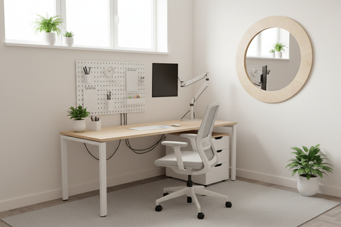
Imagine a client walking into your boutique studio for the first time. They step into a space that, while compact, feels immediately like a Workspace Sanctuary. There is no clutter, only a sense of intentionality. Their eyes are drawn upward to a beautifully curated wall that tells the story of your agency’s journey—your latest awards, a glimpse into your team’s culture, and the "Deep Work" that defines your brand. In this moment, the architecture of your lobby has already closed half the deal.
Quick Action Checklist: Lobby Vertical Branding
For a rapid assessment of your small lobby space, use these key benchmarks derived from ergonomic standards and spatial design best practices:
- Walkway Clearance: Ensure at least 36 inches of unobstructed path (standard for comfortable movement).
- Shelf Depth: Aim for <12 inches to minimize encroachment into the room's footprint.
- Visual "Strike Zone": Place high-impact brand items between 54–60 inches from the floor.
- ADA Compliance: Ensure interaction items (brochures, cards) are below the 48-inch reach limit.
- Lighting: Use warm white (3000K) accent lighting to highlight key brand assets.
For creative agencies and boutique studios operating in urban environments, every square foot is a premium asset. When your lobby is under 200 square feet, traditional floor-standing displays often become obstacles rather than assets. By shifting your brand narrative to the walls, you maintain a clear Workflow for foot traffic while creating an Aesthetic that breathes Inspiration.
The Engineering of the Vertical Brand Wall
Creating a professional brand wall is more than just hanging shelves; it is a blend of ergonomic science and interior design. In a small corporate waiting area, the goal is to maximize visibility without encroaching on the "breathability" of the room.
Our spatial modeling for boutique agency lobbies suggests that the most effective brand walls utilize shelving units with a depth of no more than 12 inches. This specific depth is a design heuristic we use to ensure that even in tight corridors, the "path of travel" remains unobstructed, aligned with general accessibility principles.
Modeling Note (Scenario A: The Boutique Lobby): This scenario assumes a 150 sq. ft. reception area with a 48-inch wide walkway. Using a 12-inch deep shelf preserves 36 inches of clear space—a baseline we recommend for comfortable movement in professional settings.
| Parameter | Value/Range | Unit | Rationale / Source |
|---|---|---|---|
| Shelf Depth | < 12 | Inches | Prevent walkway encroachment (Design Heuristic) |
| Mounting Height (Base) | 54–60 | Inches | Optimal eye-level "Strike Zone" (Anthropometric data) |
| ADA Reach Limit | 48 | Inches | Maximum height for accessible items (ADA Standards) |
| Lighting Intensity | 450–500 | Lumens/sq ft | Based on gallery accent lighting standards for color accuracy |
| Weight Capacity | 50+ | lbs | Based on ANSI/BIFMA X5.5 storage standards |
Balancing Visibility and Accessibility
One of the most common pitfalls in lobby design is placing high-value brand items too high or too low. According to the ADA Standards for Accessible Design, any item intended for visitor interaction—such as brochures or business cards—must be placed within a reach range of no higher than 48 inches.
To solve this, we recommend a "Dual-Zone" layout. Place your "Storytelling" elements (awards, team photos) in the 54-to-60-inch "Strike Zone" for maximum visual impact, while keeping "Functional" elements (brochures) at the 48-inch mark. This ensures your space is inclusive while remaining visually striking.

Space Transformation: From Chaos to Curation
The transformation from a cluttered waiting room to a professional brand sanctuary begins with selecting furniture that serves dual purposes. A standalone bookshelf isn't just a place to store books; it's a vertical stage.
Step 1: Declutter and Define
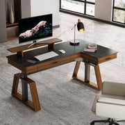
Clear the floor. In a small lobby, "visual noise" on the floor makes the space feel cramped. By using a unit like the Ark EL, 71'' Display Bookshelf with Storage Cabinet, Oak (Manufacturer Example), you can hide necessary but unappealing items—like extra cables—inside the lower cabinet while using the open upper shelves for your brand narrative. Generic alternative: Any commercial-grade 12-inch deep shelving unit with integrated base storage.
Step 2: The 70/30 Rule of Content
Based on our experience in visual merchandising and spatial design, the most engaging lobbies often follow a 70/30 content ratio (a practical rule of thumb):
- 70% Brand Storytelling: This includes industry awards, framed project highlights, or a "Mindfulness" artifact that represents your agency's values.
- 30% Functional Items: This includes business cards, your latest portfolio lookbook, or a small tray for guest refreshments.
Step 3: Integrating Sophistication
For high-value items like glass awards or delicate prototypes, a dedicated display is essential. The Curio Cabinet with Adjustable Shelves (Manufacturer Example) offers a richly lit environment that elevates the perceived value of its contents. The integrated LED lighting doesn't just illuminate; it creates an Ambiance that signals prestige to every visitor.
Linking Functionality with Emotion
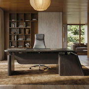
The materials you choose for your lobby furniture speak volumes before a word is exchanged. The warmth of a Dark Walnut finish or the clean lines of an Oak grain are not just aesthetic choices—they are emotional cues.
According to The 2026 Workstation White Paper: Converging Ergonomic Science and Sustainable Engineering, the integration of natural textures in the workspace can reduce perceived stress and promote a sense of well-being. When you choose a piece like the 29'' Display File Storage Cabinet, Dark Walnut (Manufacturer Example), you are bringing a mid-century modern elegance into a professional setting. This cabinet serves as a perfect "low-profile" anchor for a vertical brand wall.
The Psychology of Lighting
Lighting is the "silent salesman" of your lobby. Research on vertical surface lighting indicates that proper illumination is a key factor in visitor engagement; some retail-focused studies suggest well-lit displays can increase interaction rates by up to 65% compared to unlit areas.
We recommend using 3000K warm white LEDs. This color temperature mimics natural late-afternoon light, which is generally known to promote relaxation and trust. It also ensures that your brand colors are rendered accurately, avoiding the harsh, clinical feel of standard office lighting.
Safety and Compliance: The Foundation of Trust
In a B2B environment, professional appeal must be backed by rigorous safety standards. This is especially true for storage units in high-traffic areas.
Anti-Tip Stability
The U.S. Consumer Product Safety Commission (CPSC) recently adopted the STURDY Act (16 CFR Part 1261), which mandates strict anti-tip requirements for clothing storage units. While lobby cabinets are often used for different purposes, applying these same safety principles is a hallmark of a responsible studio. We recommend always anchoring tall units to the wall to prevent accidents, especially in areas where visitors may lean or reach for items.
Ergonomic Flow
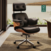
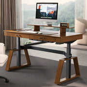
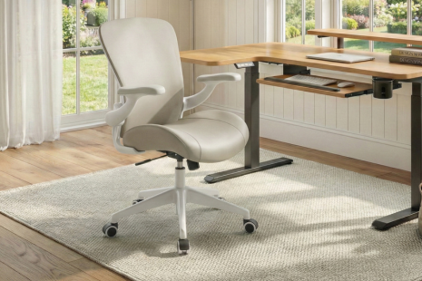
Even in the lobby, ergonomics matter. If your reception staff works in the same small area, their comfort is paramount. A compact, high-performance desk like the Ark ES Executive Standing Desk (Manufacturer Example) allows the receptionist to transition between "thinking" and "greeting" modes. According to the Canadian Centre for Occupational Health and Safety (CCOHS), the ability to adjust posture throughout the day is critical for long-term health.
Logic Summary: Our recommendation for sit-stand desks in reception areas is influenced by the "20-8-2" rhythm (20 mins sitting, 8 mins standing, 2 mins moving) popularized by Cornell University Ergonomics Web. This keeps staff alert and welcoming.
Personal Tips for a High-Impact Lobby
- Quarterly Rotations: To prevent visual fatigue, rotate approximately 20% of your display every quarter. This shows that your agency is constantly evolving.
- The "Greenery" Effect: Integrate low-maintenance plants like Snake Plants on the higher shelves. This adds a "biophilic" element that, when paired with an Oak bookshelf (Manufacturer Example), creates a holistic brand wall.
- Cable Management: Nothing ruins a professional aesthetic faster than visible wires. Ensure your cabinets have discreet cable routing for any integrated lighting.
- Scent Branding: While vertical branding is visual, it can be supported by a subtle scent diffuser hidden on a lower shelf of a storage cabinet (Manufacturer Example).
Creating a Lasting Professional Impression
The investment in vertical branding is an investment in your agency's perceived value. By utilizing slim profiles, proper lighting, and high-quality materials, you transform a simple entrance into a powerful narrative tool. Whether it's the mahogany veneer of an executive desk or the warm glow of a display cabinet, every element should work together to create a space where creativity feels limitless.
For more insights on optimizing small professional environments, explore our guide on 3 Small Office Layouts for Maximum Productivity or learn about Evaluating Modular Layouts for Rapidly Expanding Collaborative Zones.
Disclaimer: This article is for informational purposes only and does not constitute professional interior design, legal, or safety advice. Always consult with a certified professional to ensure your office layout complies with local building codes and ADA requirements.
Sources
- BIFMA G1-2013 Ergonomics Guideline for Furniture
- CCOHS: Office Ergonomics - Sit/Stand Desk
- Cornell University Ergonomics Web — Workstation Guides
- CPSC – New Tip-Over Safety Standard for Furniture
- ISO 9241-5:2024 Workstation layout & postural requirements
- Tutorial: Rationale, Concepts and Techniques for Lighting Vertical Surfaces
Leave a comment