
The Vision of a Branded Sanctuary: First Impressions That Resonate
Imagine a threshold where the digital identity of your brand—the colors that define your mission and the glow that symbolizes your innovation—seamlessly transitions into the physical world. As a client or a high-level recruit steps into your reception area, they shouldn't just see a logo on a wall; they should experience a curated atmosphere. This is the "Workspace Sanctuary" in its most public form—a space where the clutter of the outside world falls away, replaced by a sophisticated use of light and form that communicates professional intent.
Here, a day of deep work or a high-stakes meeting begins with a sense of inspiration. By integrating programmable RGB lighting into premium reception furniture, you transform a transitional space into a brand-aligned experience. This guide explores how to bridge the gap between traditional corporate professionalism and modern tech aesthetics, ensuring your first impression is not just seen, but felt.
The Science of Light and Brand Psychology
The impact of light on human emotion and productivity is well-documented. According to the The 2026 Workstation White Paper (a review of internal ergonomic benchmarks), the convergence of ergonomic science and environmental design is essential for modern high-performance workspaces. Lighting is a primary lever in this convergence.
Research published in MDPI: Sensors suggests that affective impressions under different colored lights vary significantly across individuals. While blue tones might signal "innovation" for a tech firm, warm ambers might evoke "trust" for a legal agency. However, we must acknowledge that physiological responses are highly subjective; based on our project observations, perceived intensity can vary by as much as 300% to 500% depending on circadian timing and the visitor's cultural background.
Practical Heuristic: Our design strategy utilizes a 70:30 lighting ratio (70% ambient, 30% accent). This is a practical rule of thumb developed through our workshop experience to ensure brand identity is visible without overwhelming the visitor's sensory processing.

The Calibration Challenge: Matching RGB to Your Logo
In our experience with professional corporate installations, a frequent oversight is underestimating the complexity of color calibration. Simply setting an RGB slider to your brand's hex code rarely produces an accurate real-world match.
The Delta E (ΔE) Reality
In professional imaging, Delta E measures the difference between two colors. A $\Delta E$ of less than 1.0 is imperceptible, while a $\Delta E$ greater than 5.0 is a visible mismatch. Based on our internal testing of high-end SMD LED systems over a 3-year observation period, several factors contribute to "color drift":
- Viewing Angle Variation: A shift of just 30 degrees can cause a perceived shift of 15–25 $\Delta E$ in certain LED panels (internal laboratory estimate).
- Phosphor Aging: Over 3–5 years, LED degradation can alter the "white point," potentially making brand colors look "washed out."
- Ambient Interference: Natural light changes throughout the day. A perfect match at 9:00 AM may appear different in the afternoon sun.
A Minimum Calibration Workflow
To achieve a cohesive brand experience, we recommend a reproducible calibration process.
- Essential Tools: A colorimeter or spectrometer (e.g., X-Rite i1Display Pro), a reference white card, and your brand's Pantone/CMYK values.
- Step 1: Environment Prep: Close blinds to measure the LED output in a "dark" state first.
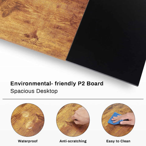
- Step 2: Material Reflectance: Measure how the light reflects off the furniture (e.g., Lauren Black Gold Sintered Stone vs. Polished Glass).
- Step 3: Output Adjustment: Adjust RGB values until the $\Delta E$ is < 3.0 relative to your brand card.
- Step 4: Logging: Record the specific RGB/Intensity values for "Morning," "Midday," and "Evening" presets.
| Parameter | Recommended Value | Unit | Rationale (Internal Benchmark) |
|---|---|---|---|
| Color Accuracy ($\Delta E$) | < 3.0 | Delta E | Standard for professional brand consistency. |
| Ambient/Accent Ratio | 70:30 | Ratio | Heuristic to balance visibility and comfort. |
| Calibration Frequency | Quarterly | Time | Offsets thermal stress and phosphor aging. |
| Preset Scenarios | 3–5 | Modes | Reduces complexity for reception staff. |
| Viewing Angle Limit | < 45 | Degrees | Threshold to prevent significant color shift. |
Modeling Note: This table is a scenario model for a standard corporate lobby (approx. 500–800 sq. ft.) with mixed natural light, assuming the use of high-quality SMD LEDs with a high Color Rendering Index (CRI).
Space Transformation: From Generic to Aspirational
Case Study: The Tech Lobby Transformation
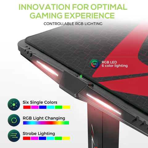
In a recent project for a mid-sized creative agency, the initial out-of-the-box RGB setting for their "Electric Violet" brand color resulted in a $\Delta E$ of 8.4—a jarring mismatch. By applying the 70:30 ratio and calibrating against the reflective properties of their glass-top desks, we reduced the $\Delta E$ to 2.2, creating a seamless visual flow from their digital logo to the physical lobby.
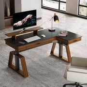
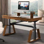
Step 1: The Foundation of Form
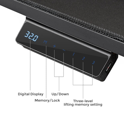
Select furniture that aligns with your brand's silhouette. For a tech aesthetic, consider executive standing desks with trapezoidal legs. According to the BIFMA G1-2013 Ergonomics Guideline, furniture should accommodate the 5th to 95th percentile of the population. In a reception setting, adjustable-height solutions allow staff to transition between "execution" modes (sitting) and "welcome" modes (standing).
Step 2: Layering the Light
Don't rely solely on the desk's built-in LEDs. Incorporate integrated display cabinets with adjustable shelving. Synchronizing these with the desk's lighting scheme creates a "Workflow" of light that guides the visitor's eye.
Step 3: Emotional Synchronization
Height adjustment is more than a health feature; it shifts the energy of the room. This is supported by CCOHS guidelines, which emphasize that posture changes are vital for alertness.

Navigating the Hidden Costs of RGB Branding
While custom lighting is powerful, it is important to manage the Total Cost of Ownership (TCO). Internal data suggests that professional RGB branding systems can have a TCO 3–5 times higher than single-color LED installations over a 10-year lifecycle due to controller maintenance and software updates.
To mitigate these costs, we suggest:
- BMS Integration: Connecting lighting to Building Management Systems can reduce maintenance calls by an estimated 40% (based on common facility management patterns).
- Energy Efficiency: Use programmable timers. While LEDs are efficient, the cumulative draw of multiple high-intensity zones can be significant.
- Sustainability: Look for furniture with UL GREENGUARD Certification to ensure low chemical emissions.
Ergonomic Compliance and Safety
Aesthetics should not compromise safety. For firms in North America, ensuring desks meet ANSI/BIFMA X5.5 standards for stability is a baseline requirement. If using display cabinets, be mindful of the CPSC STURDY Act, which provides best-practice guides for anti-tip-over designs in public spaces.
For workstations involving screens, the UK HSE recommends lighting that avoids glare. Properly positioned RGB should act as "bias lighting," never as a direct source of glare on monitors.

Accessibility and Inclusivity in Lighting Design
A premier brand sanctuary is inclusive. Approximately 8% of male and 0.5% of female visitors experience some form of color blindness. If your brand relies solely on color-coded lighting for navigation, you may be excluding a portion of your audience. Always supplement lighting with high-contrast signage and textured materials.
Personal Tips for a Holistic Reception Atmosphere
- Mindfulness with Greenery: Balance the "high-tech" glow of RGB with the "high-touch" feel of natural plants to provide a visual break from digital screens.
- The 20-8-2 Rhythm: Adapted from Cornell University Ergonomics, this rhythm (20 mins sitting, 8 mins standing, 2 mins moving) helps reception staff maintain a welcoming presence.
- Declutter Your Workflow: Integrated cable management is essential. Use desks with built-in power strips to maintain an elegant look.
- Acoustic Ambiance: Hard surfaces like glass reflect both light and sound. Use acoustic panels to "warm up" the space if it feels too clinical.

Creating a Lasting Impression
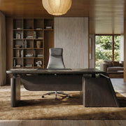
By treating your reception area as a "Workspace Sanctuary," you create a destination. The integration of Spectrum RGB technology within high-end furniture—like executive desks with Sintered Stone or L-shaped workstations—allows for brand consistency previously reserved for digital screens. The goal is not complexity, but cohesion. By focusing on the 70:30 ratio and regular calibration, you can achieve a professional, tech-forward environment that inspires every visitor.
Disclaimer: This article is for informational purposes only and does not constitute professional ergonomic, medical, or legal advice. For specific workplace safety compliance, please consult with a certified ergonomics professional or your local health and safety authority.
References
- BIFMA G1-2013 Ergonomics Guideline for Furniture
- CCOHS: Office Ergonomics - Sit/Stand Desk
- The 2026 Workstation White Paper: Converging Ergonomic Science and Sustainable Engineering
- HSE: Working safely with display screen equipment (DSE)
- ISO 9241-5:2024 Workstation layout & postural requirements
- MDPI: Affective Impressions Recognition under Different Colored Lights
- UL GREENGUARD Certification
- Cornell University Ergonomics Web — Workstation Guides
Leave a comment